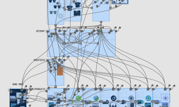
Following on from the design process of creating the layout for the brutalist record store website, the next step was to add some products to make it an actual store, instead of a basic website. Since this the concept is a record store, it’s important that there is a good range of vinyl records on offer. Based off the layout of the homepage I decided that I would design 6 unique vinyl records that have an entirely original front cover, with a specially designed vinyl record variant to accompany it. Below is each project that will be displayed on the website.
Album Covers
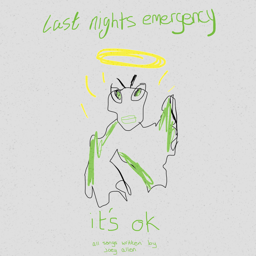
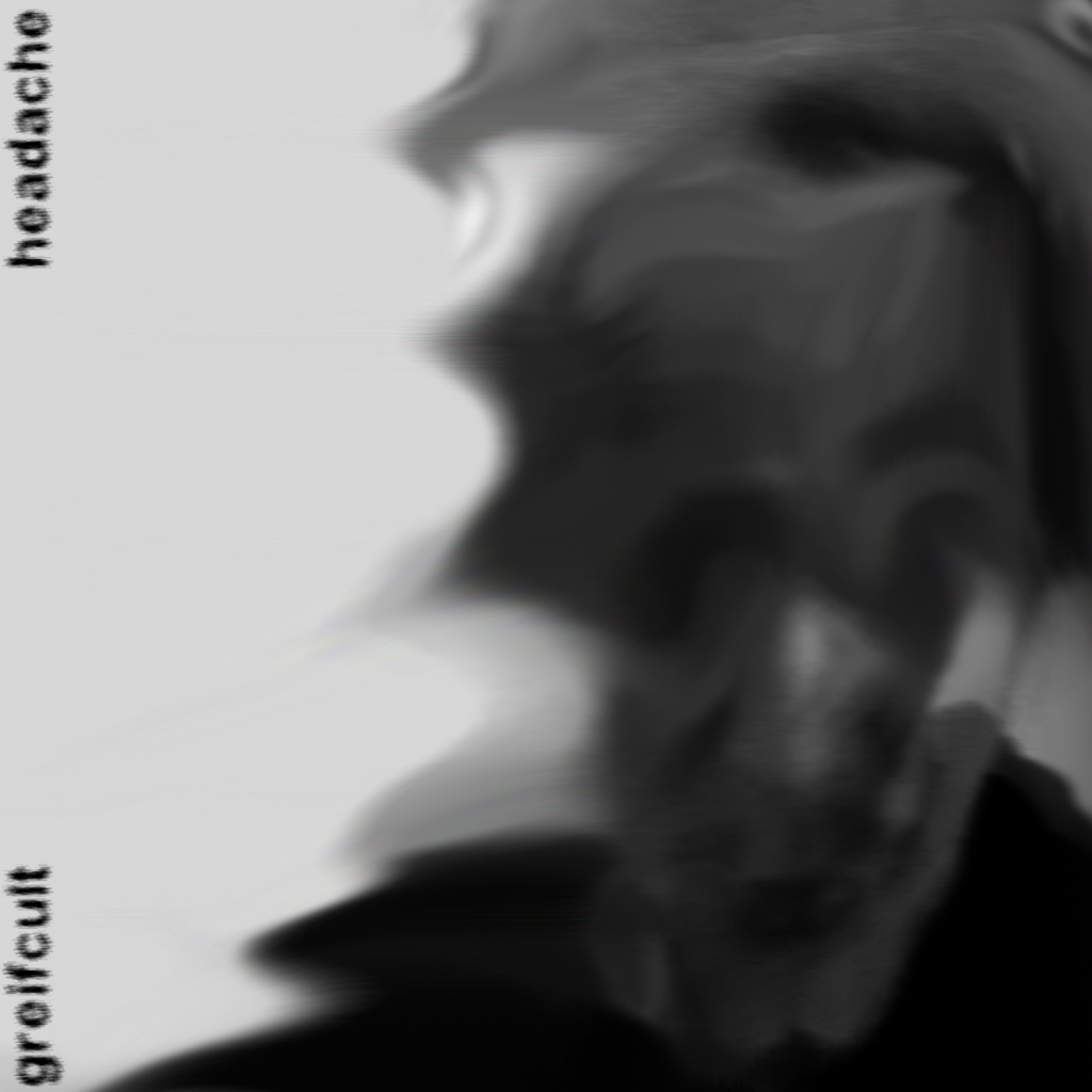
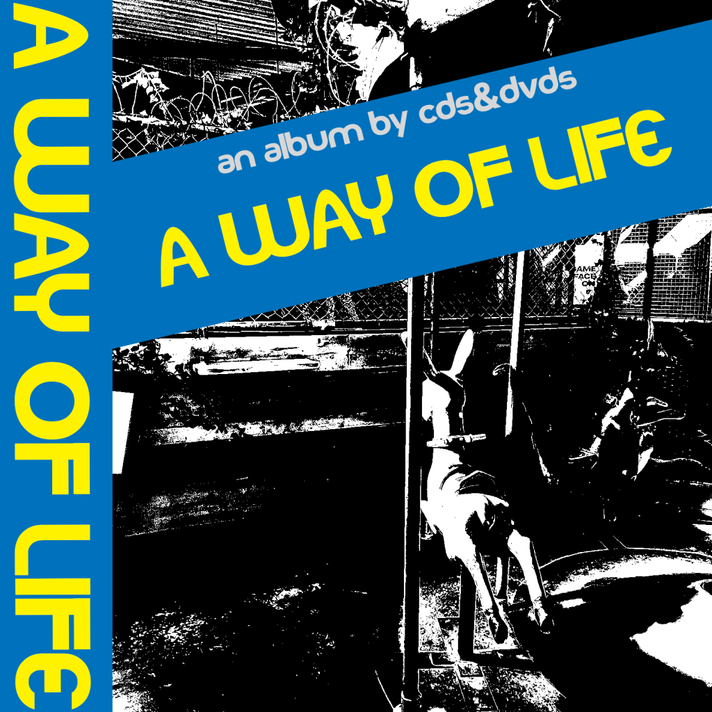
I attempted to capture various genres within each of the projects I designed, from indie rock to metal to experimental. Each album cover is representative of then genre in the project and also serves as inspiration for the vinyl record variants. All images and designs seen within these covers have been created entirely by myself from drawings or photographs I have taken, in an effort to keep every assets created entirely original and unique to the concept.
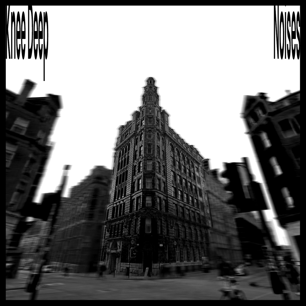
Within these covers, I attempted to take aspects of brutalism both in the architectural sense and graphic design sense. For example the ‘Knee Deep’ project features a tall monochromatic building centralised on the front. This is in reference to my past point, in conjunction with Johnny Levanier’s comment on how brutalism ‘describes more of a mindset than visual characteristics'(Levanier, 2021) and how brutalism as a movement is up for interpretation. This cover specifically takes both definitions and combines them into a succesful product.

Vinyl Records
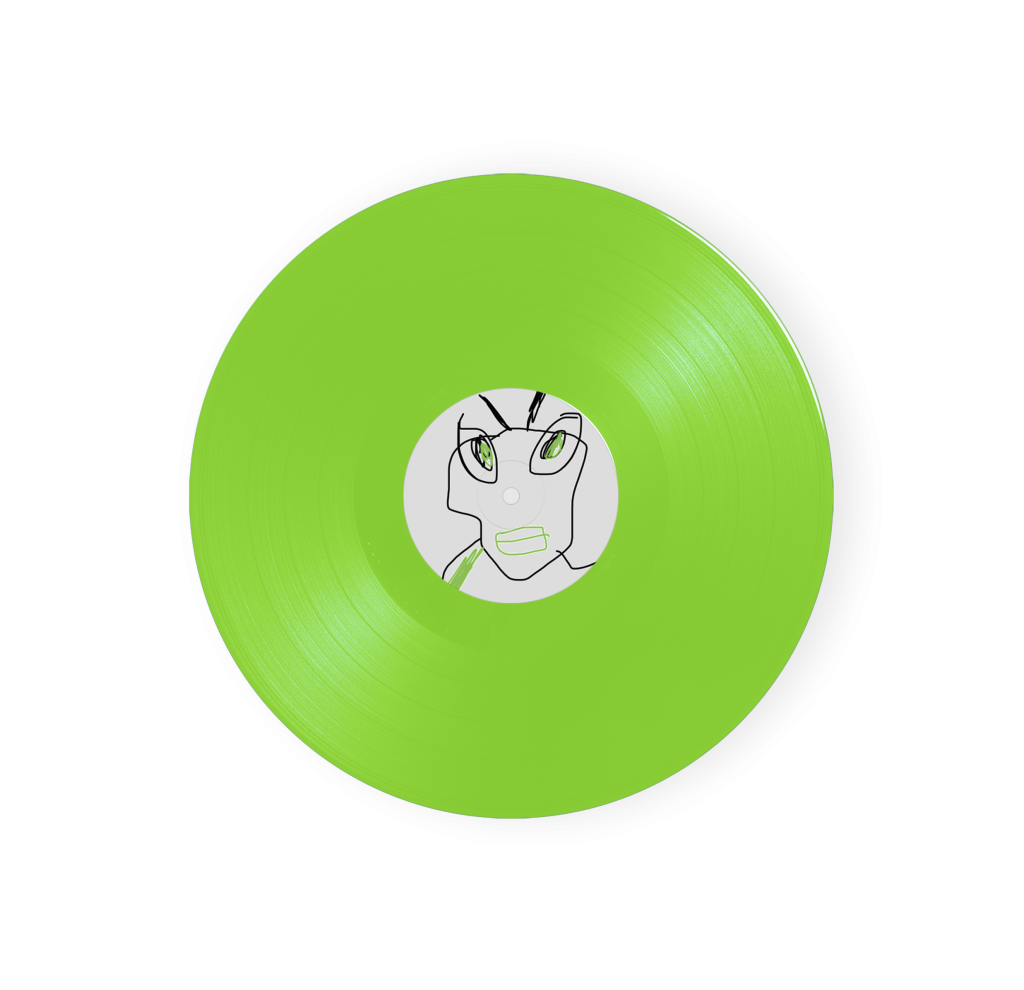
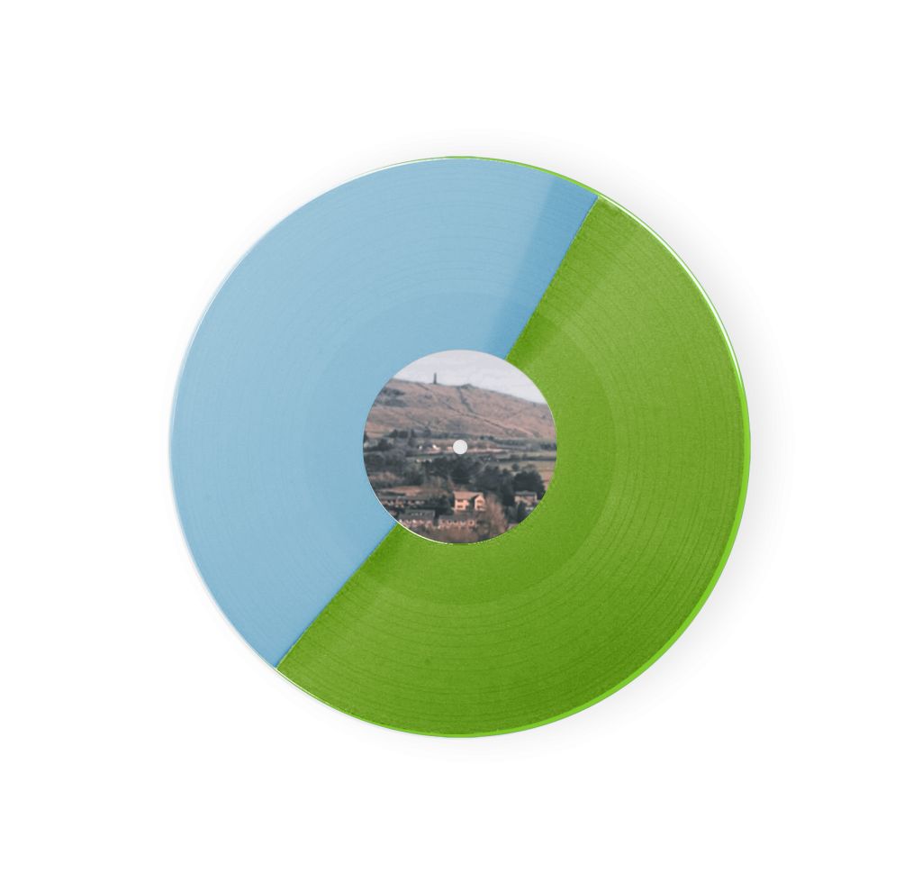
Following on from creating the album covers, the next step was to create vinyl record variants for each project that were reminiscent of that cover. I decided to try vary each record by creating a new style of variant for each project (excluding the ‘greifcult’ and ‘last nights emergency’ projects which feature solid colours). This ranges from splatter designs to split records where one half of the record is a different colour to the other.
Each of these records also included a unique centre label that either matched the album cover, or was designed in a similar way. This is an added feature that is seen on all records but adds some further depth from a design standpoint.


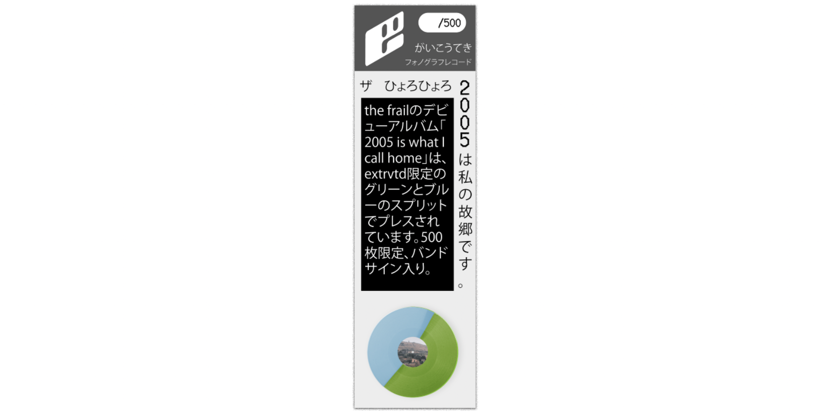
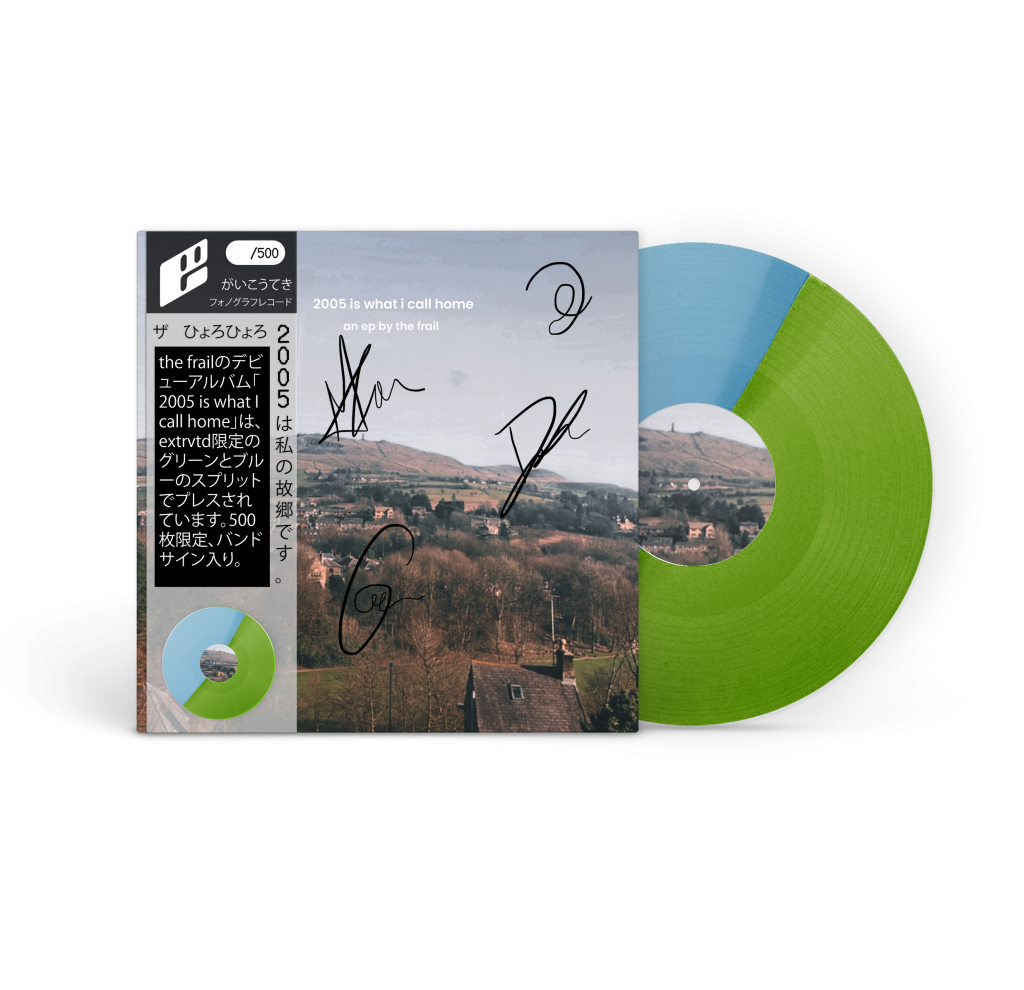
Obi-Strips
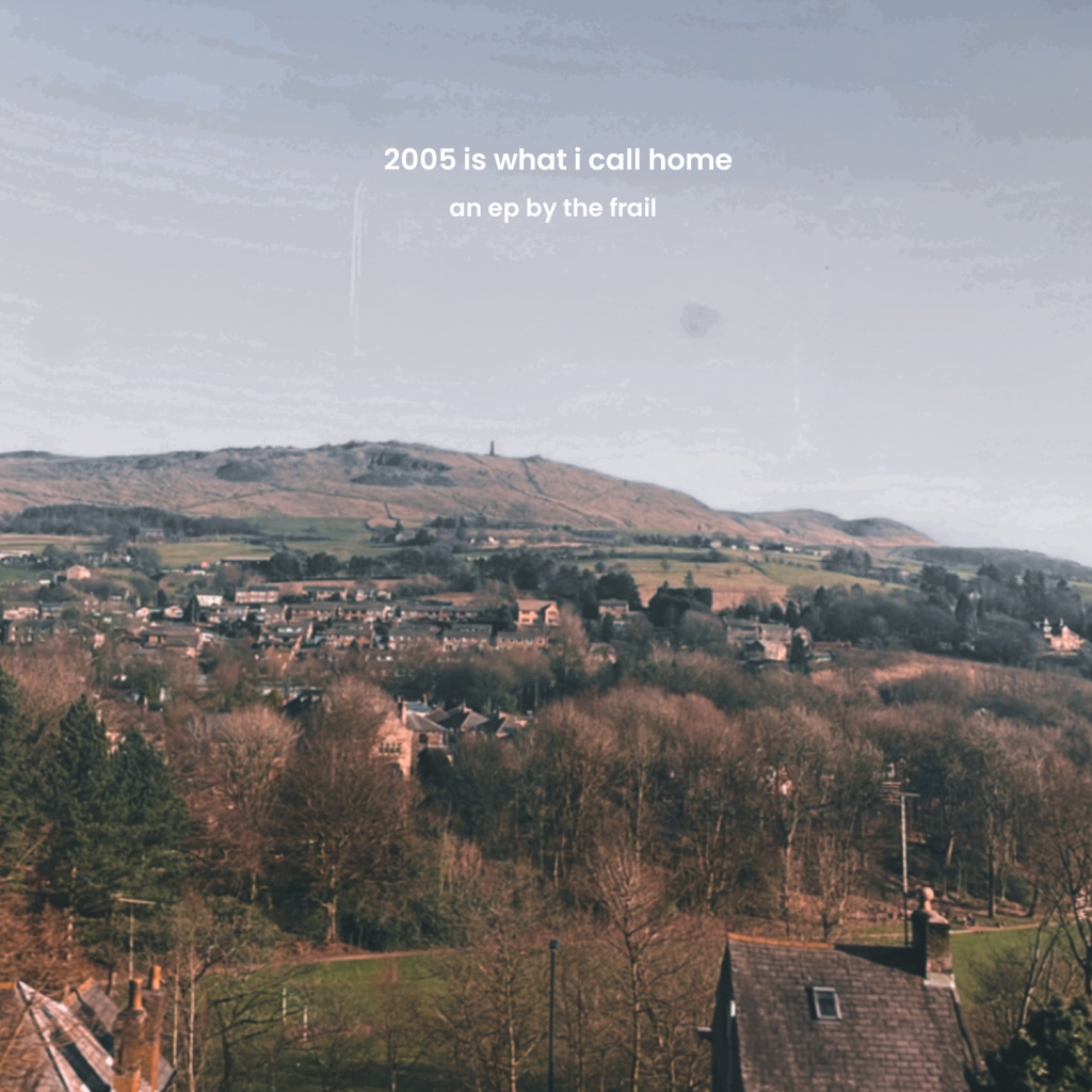
During my initial research, I looked into the Japanese obi-strips that feature on the front of vinyl records that are produced in Japan. This was something I wanted to adapt to fit the extrvtd theme and offer special editions featuring this addition. The obi strip features details about the project and artist, a mockup of the record as well as a spot for a handwritten number. I also combined this concept with a signed edition which involves bands or artists adding their autographs to a limited run of records to be sold on the web store. To display this, I used the ‘2005 is what i call home’ ep by the frail which can be seen in Figure 14.
Adding to Website
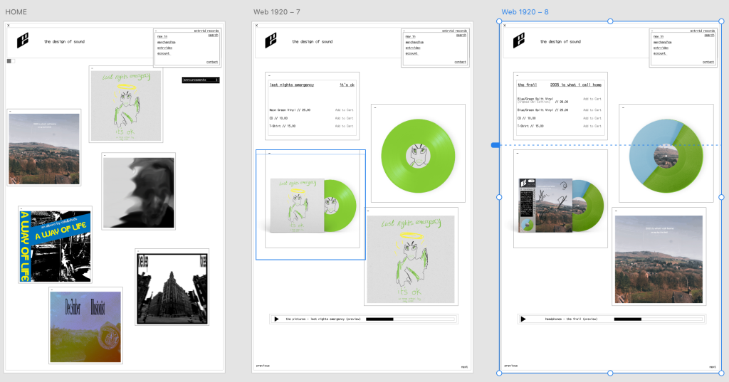
Each asset design above was added to the website, following the theme proposed previously.
References
Levanier, J. (2021) Brutalism in design: its history and evolution in modern websites. 99designs. Available online: https://99designs.co.uk/blog/design-history-movements/brutalism/ [Accessed 18 Mar. 2023].