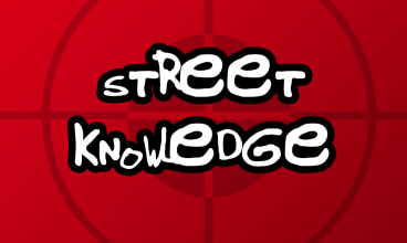
I was given the task of re-designing my original logo of my name, and transforming it into a coloured version with a new set of text. Below is my finished design which has kept most of the same characteristics as before, but now it features the words ‘Music Design’ and focuses on 3 colours; Red, White and Yellow…
I once again used Adobe Illustrator and predominantly focused on the type on path tool to get the shape, however each letter has been changed to a new colour, with the title being highlighted in yellow and white at the front to pop out to the audience instead of the red letters that circle around the back of the design.
I decided to go with Music design as the text since I figured it pretty much summed up my inspirations from before, as I am interested in the different design aspects of music. This being artwork, music videos and physical items of music for example. I chose yellow as the main colour to show the title as it stands out well from the background and I believe its a very attractive colour for people to read. Furthermore yellow is a warm colour and it brings out the passion I have for music design, which is why I chose it to be the main colour along with white. I additionally chose red as its harder to read instantly so therefore it makes the yellow and white text stand out even more and further reinforce the fact that its the title. Also red is considered to represent courage which I think is appropriate towards my attitude for design but also music, which putting them together creates the perfect mix.