Since my concept is a brutalist record store, I decided the best way to present my concept would be through a website that is designed following the brutalist web design themes I researched previously. This website would house all of the assets and concepts that link to my idea such as the products, posters as well as other features you would expect to see on a e-commerce website.
Layout
Before creating my website, I need to decide on a layout and design style that will be used as a reference for each page. I needed to make sure that it matches the branding I’ve designed, while remaining true to the brutalist theme I’m aiming to achieve. Referring back to my research and sketches from the previous post, the Japanese website ‘Utrecht’ stuck with me for its simple yet effective design style. They operate on a limited colour scheme of just red and white, with the only other feature of any colours coming from images. This was something I admired and wanted to carry over to my website by only using two colours (one for a base colour, the other for typography) and keeping other colours reserved for my product images, videos and the design manifesto for example.
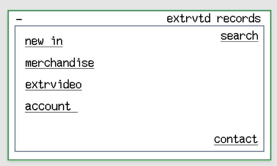
I decided to keep it simple by using white as the base colour for my site, and use black for any typography and icons. However I opted for different shades of grey for outlines of boxes and miscellaneous items amongst the website. Below is the layout designed for the homepage following my initial sketches, which carries most of the design aspects that influence the rest of the website.
Home
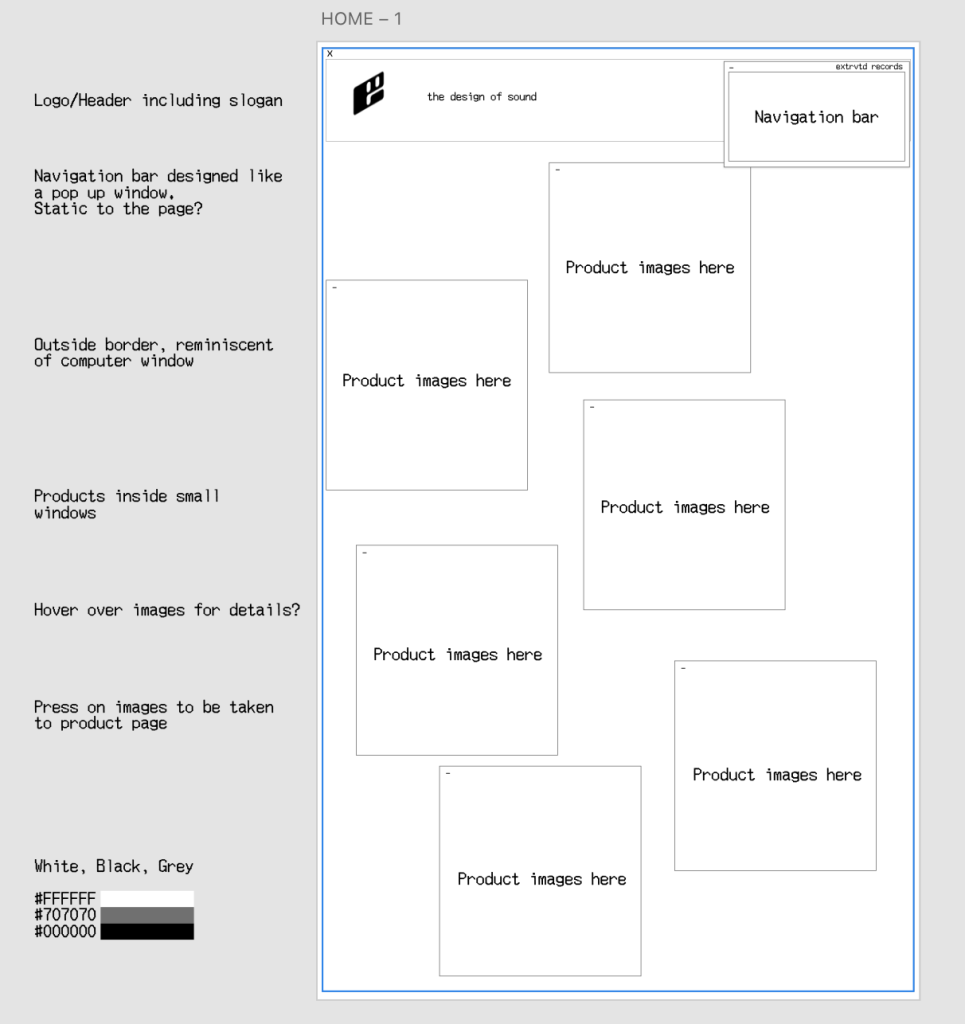
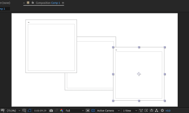
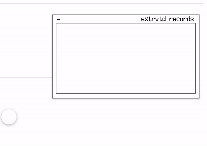
The homepage was designed to mimic the incomplete and unpolished look of brutalist web design, while incorporating ‘web-safe colours’ as well as ‘geometric components and sharp edges’ (Shivro, 2022). Each asset would be clickable in some way, from the product images directing you to their respective page, to the navigation bar having the ability to minimise and expand. For each page, the header with logo and slogan will be present at the top, whereas the navigation bar will be fixed when you scroll so it is always in view (seen in Figure 6). This idea fits well into the concept of ‘overlapping elements’ (Houk, 2022) that is common within brutalist web design.
Once the homepage was designed, I used this layout as the basis for pages going forward. The next page to be developed was the individual product pages which is where the vinyl records and merchandise would be displayed, ready for customers to purchase.
Product Pages
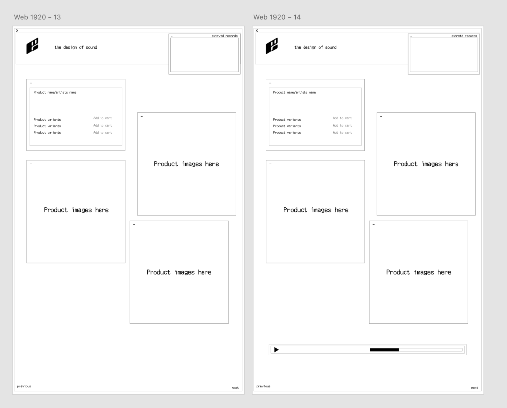
On the product page, I used a similar window style for each of the product images, as well as a smaller one for the product details. This would be where the user can see the title of the product, the variants (colours or sizes) as well as the option to add the desired product to the cart to then purchase. Additionally, after further development and feedback I decided to include a music player icon. The idea behind this addition is so that customers are able to preview the music from that specific artists before they purchase, in the form of a 30 second snippet.
Videos & Manifesto
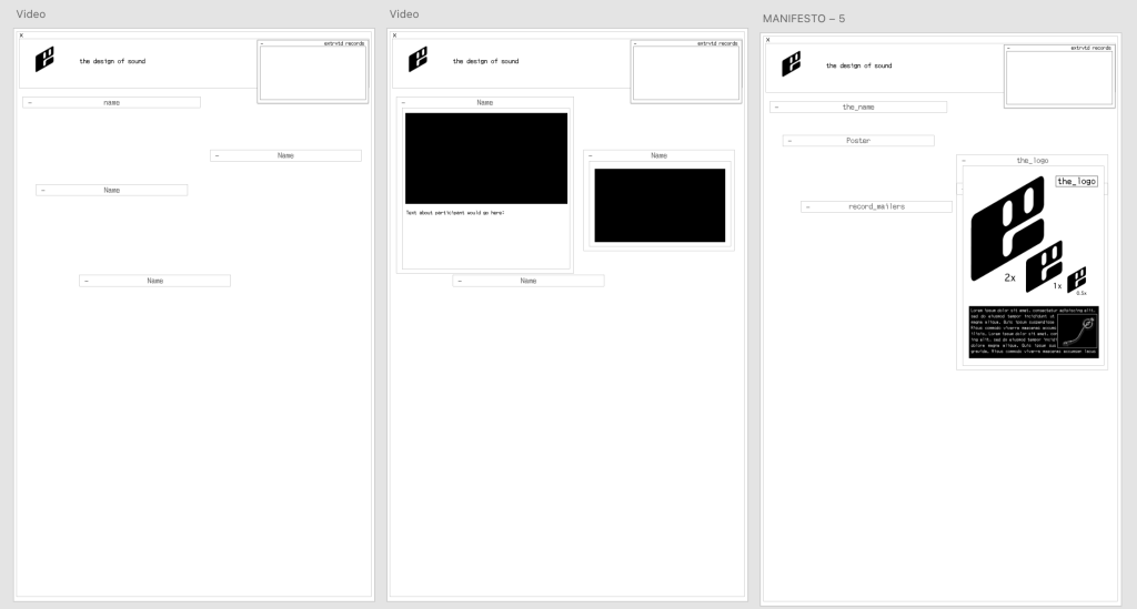
Another aspect of the website is the video section. This is a separate part of the brand which revolves around sharing vinyl record related videos featuring guests from different background. The video page in particular is once again going to follow a similar format of window style assets containing the content, but in this case each video can be minimised and expanded. The page opens up with all videos minimised, only displaying the name of the guest, or the title of the video. The user can then expand the window to view the video as well as a short description of the guest.
Furthermore, I used the exact same design layout for the ‘design manifesto’ page. This is a hidden page which displays a range of design elements from information about the brand identity of extrvtd, as well as advertising posters. The premise of this design manifesto is to offer some clarity on why the brand is designed the way it is, and help users understand brutalism in a unique way. This page displays these assets through the expandable menus that were developed within the videos page. To demonstrate how these images are displayed, I have begun to include some of the design manifesto assets I created after my research in trimester 1.
Development
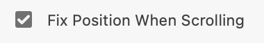
After creating each page and finalising what needed to be included within the website, I started to develop some of the assets seen within these webpages. One of the main aspects I needed to add to was the navigation asset, in order for the user the go from one page to another. I added each page down the left hand side that when pressed, will take the user to their desired destination. In addition I also added a search function as well as a contact button where customers would be able to get in touch with extrvtd for help with orders or any other questions about the brand. For this navigation tab, I also made sure to select ‘Fix Position When Scrolling’ as this would fix this tab to the page so when you scroll, it scrolls with you. A demonstration of this can be seen in Figure 6.
The Next Steps
Following on from creating the layout and design style for the website, the next task would be to begin adding assets to the website, such as products. This will include items such as the unique vinyl records, merchandise like t-shirts as well as accessories for record players (like slip mats). Adding these will make the website start to look more like a functioning e-commerce website for a record store, rather than just the basic framework of any ordinary website.
References
Shivro, N. (2022) What Is Brutalism in Web Design? Elementor. Available online: https://elementor.com/blog/brutalism-in-web-design/ [Accessed 13 Apr. 2023].
Houk, R. (2022) New Brutalism and web accessibility: what you need to know. Medium. Available online: https://uxdesign.cc/new-brutalism-and-web-accessibility-what-you-need-to-know-c0a24dfce429 [Accessed 13 Apr. 2023].