Following on from my research in trimester 1, I have decided to produce a brutalist record store concept, all encased in a website prototype. This website will display a range of music products such as vinyl records as well as related items such as t-shirts and record accessories. The entire website and design of products will follow the brutalism themes researched and discussed in the proposal, while also adding my own unique twists to create a full developed product. My intention is for the website to be fully functional when browsing the products or assets and act as a professional example for future reference.
Software
My two chosen softwares for this project are Adobe XD and Adobe Photoshop. XD is the software I will be using to create the website prototype and it allows me to create a functioning product, made up of text and visual based assets. Instead of creating individual pages to present, I am able to link pages to each other to simulate how a website would perform. In addition to XD, I will use Photoshop as the basis for my designs such as the vinyl record mock ups as well as other visuals such as a ‘design manifesto’. Once designed within Photoshop, any assets can be seamlessly imported into XD to complete the website.
Branding
Name
The name I have given to this project is ‘extrvtd records‘. This was the name I proposed in my research and is an identity that I am happy with expanding upon to create a developed brand within this product. ‘Extrvtd’ is a shortened version of the word ‘extroverted’ which I believe fits the brutalist theme due to its connotations to an ‘outgoing’ and ‘confident’ environment. Based off my previous research, brutalist web design can be described from these words as it is very raw and over the top.
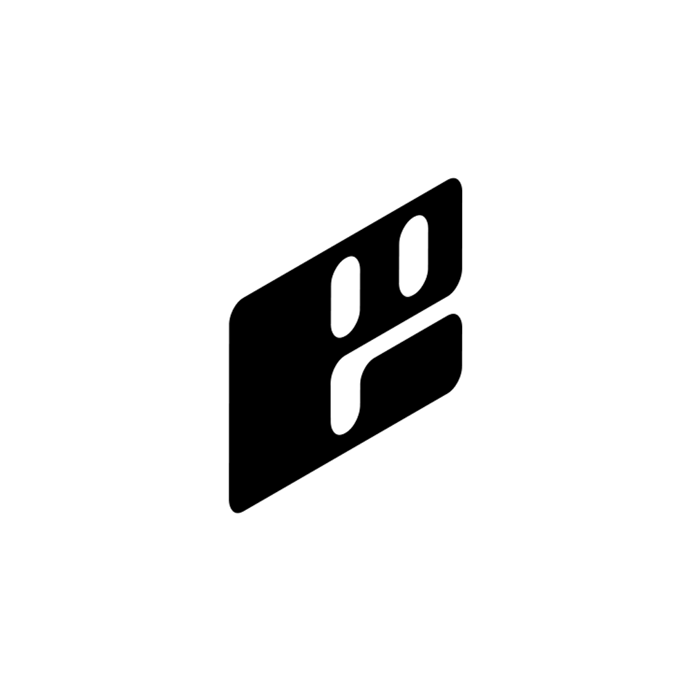
Logo
In addition, I have decided to stick with my proposed logo as I feel it fits the project well. This logo incorporates a few aspects of my subject, such as a record player arm, the centre label of a record as well as portraying a face. This is in addition to it presenting the letter E as the main identifier for ‘extrvtd records’. This logo will be used on a wide range of assets such as the website header, extrvtd merchandise as well as any advertisement or posters within the design manifesto.
Font
My chosen font for my website is ‘Merchant copy’ which is a computer style font that I believe not only matches the aesthetics of my concept, but also works fluently within Adobe XD. This font will be the only font used within the websites framework, however other fonts may be used as part of designs (album covers, merchandise etc.).

Website Plan
Before creating my website, I need to have a plan in place that I can refer to in order to create an effective product. In addition I need to refer to my research from trimester 1 to remain true to the brutalist concepts I found, while also creating a unique website.
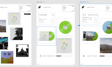
As this is a record store concept, I need to include a page dedicated to individual products, as well as one to house a selection of these records for people to browse and then purchase. My initial idea is to display a selection of my own designed albums, directly on the landing page of the website. The user would then be able to click the album cover and be directed to an entire product page where they can see further images and options to purchase.
In addition to these pages, I plan to include a product page for merchandise (as well as the individual pages, similar to the vinyl record pages) as well as pages for a video series, and a simple account page for customers to view orders. Furthermore, I plan to include a hidden page which will contain a variety of visuals in the form of posters that make up a ‘design manifesto’. The concept behind this is to show customers visually, why the website and brand has been designed the way it has. This was also house advertising posters that would be placed physically in person to advertise the brand as a whole.
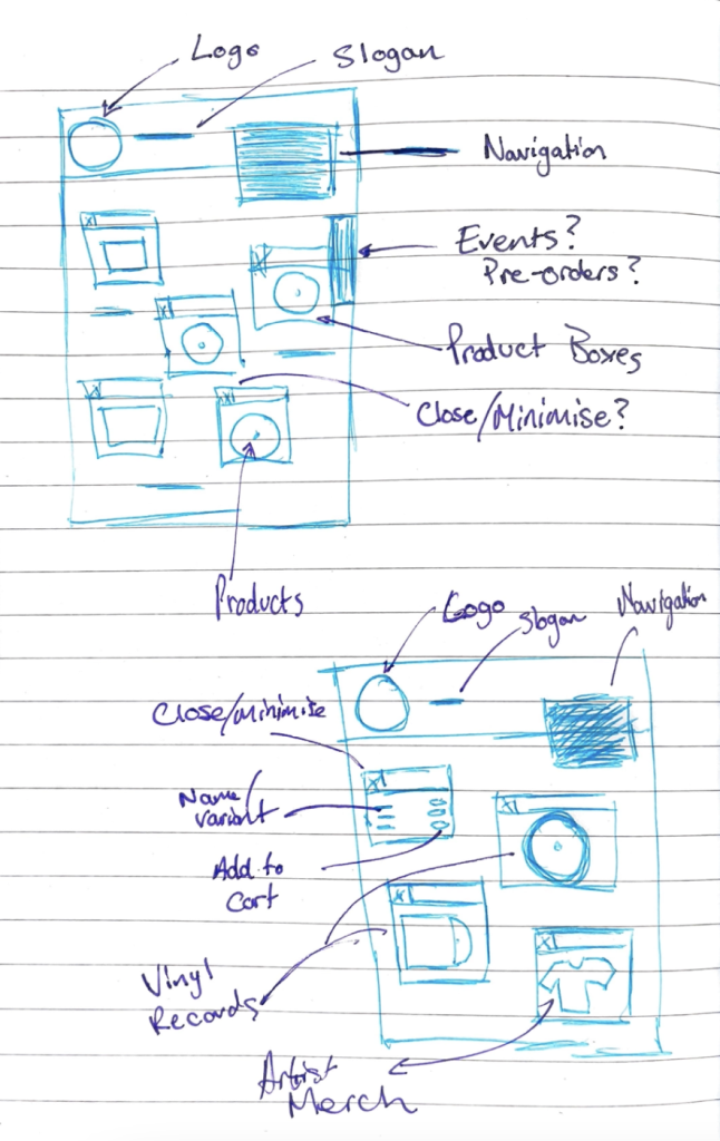
Below is the initial sketch of how the website will be designed. The rest of the website will follow this rough theme.