For my major project, I have decided to explore the influence of brutalist graphic design movement in the context of the music industry. Focal points for research will look at album artwork, store interior design as well as how this style can be presented through packaging. Within this project I will aim to answer the question ‘How can the brutalist design movement be applied to the resurgence of records and physical stores?’. Graphic design and music in general are two things I am very passionate about which is why I’d like to explore the concept of brutalism within graphic design and combine that research with my love for music.
Utilising findings from the research carried out, my product I will develop is a ‘brutalist record store’ concept, designed and produced in the style of the brutalism. This idea will involve the production of branding for the business as well as the following;
- Vinyl record variants and designs, exclusive to the record store
- Merchandise in the style of brutalism, ranging from clothing to tote bags
- Vinyl record accessories such as items to clean records or keep them safe
- Packaging for products (Both for sale and for mailing)
In addition I plan to design a prototype website that customers can visit to browse and purchase these products. These assets will be designed to fit the brutalist theme and will carefully consider the ideal target market when picking the correct design styles as well as choice of purchasable items.
What is Brutalist Graphic Design?
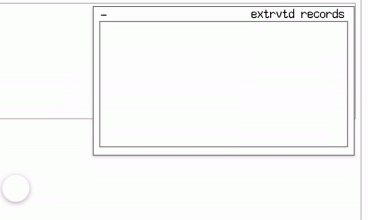
Brutalist graphic design is a style and movement that intends to go against design stereotypes with the mission of standing out. This style is purposely designed to have a ‘lack of concern to look comfortable or easy’ (Deville, 2018). Although usually up for interpretation, brutalist graphic design usually looks incomplete or unpolished, such as overlapping shapes or typography presented in fonts that usually would not be paired together, as seen in Figure 1. Examples of this design style is usually delivered in the form of websites but can also be seen within album covers and promotional posters. Brutalist graphic design as a whole is not connected to brutalism within architecture however some aspects visually carry over and can be referenced in design products.
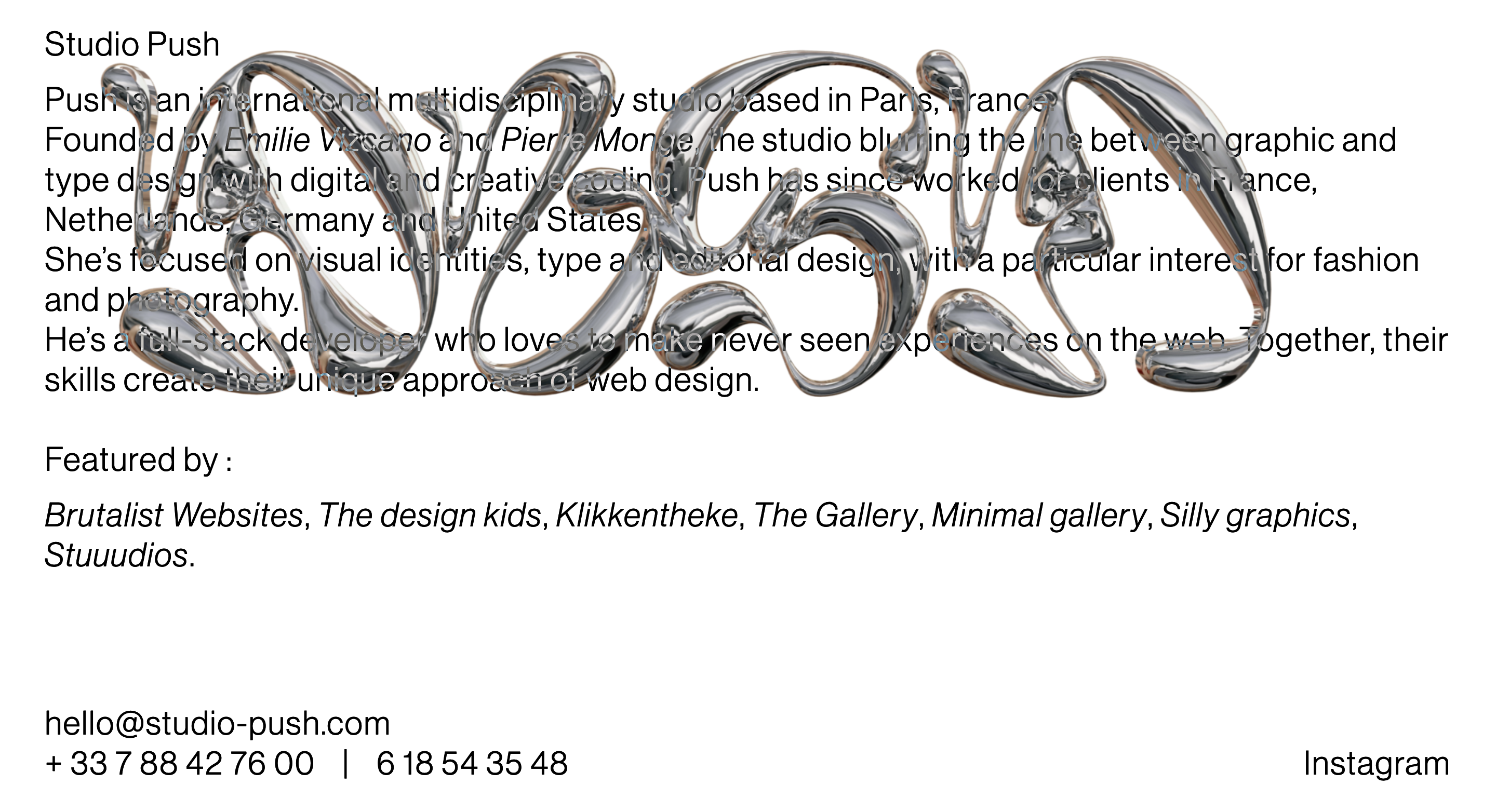
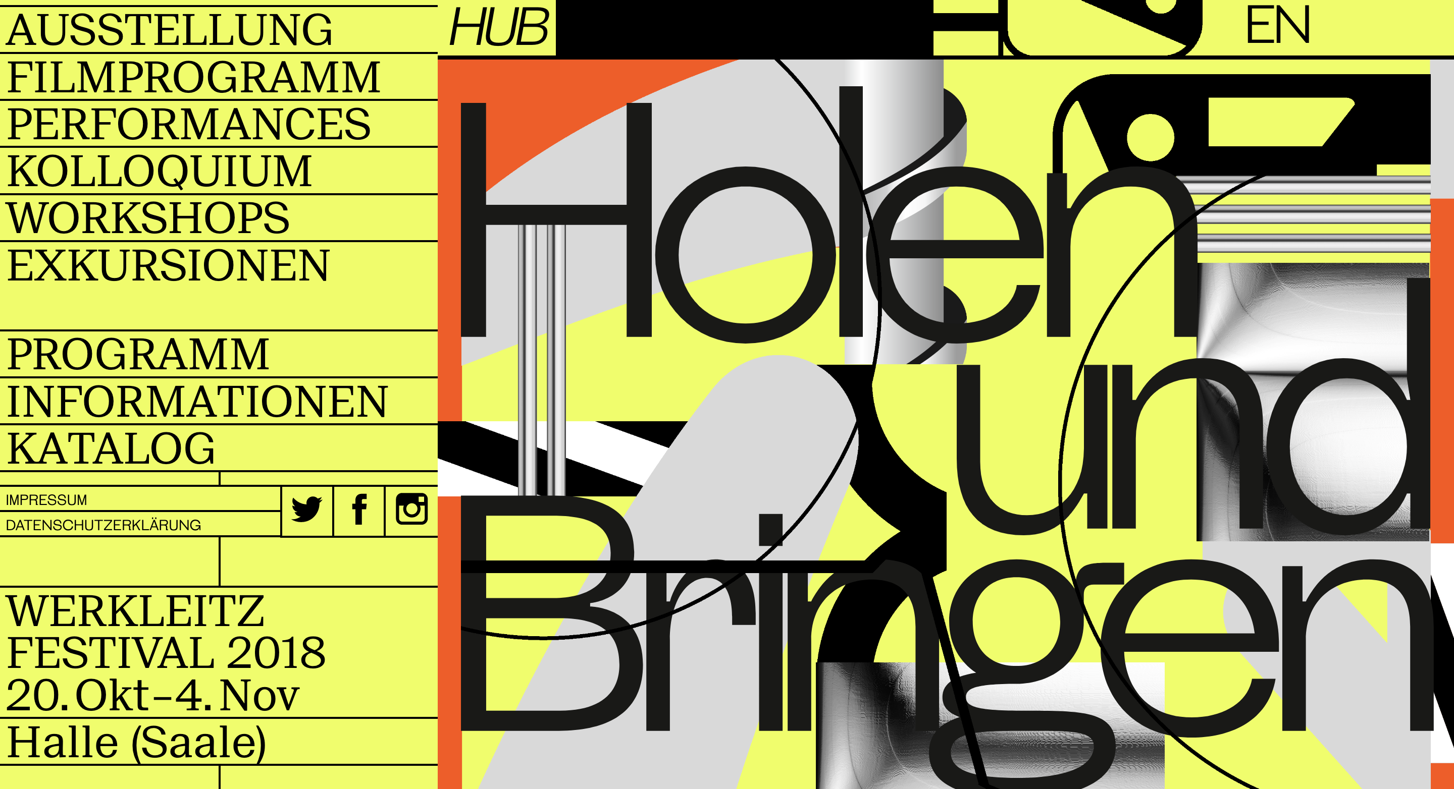
Figure 1 and Figure 2 show two varying examples of a brutalist design website. Studio Push decided to stick to the monotone colour scheme with very basic text and a dynamic metallic image, whereas Werkleitz Festival in figure 2 decided to go bold and include abstract colours that have been partnered with simple but effective fonts.
Below is an image Elementor put together for their blog on ‘How to Use Brutalism in Web Design’ (Shviro, 2022) which features multiple different aspects of the style to consider. This includes dividing lines between different sections as well as raw photos (images that haven’t been altered shape or design wise). In addition they have also designed this piece to include monotone colours with a splash of a neon orange to add further depth to the image.
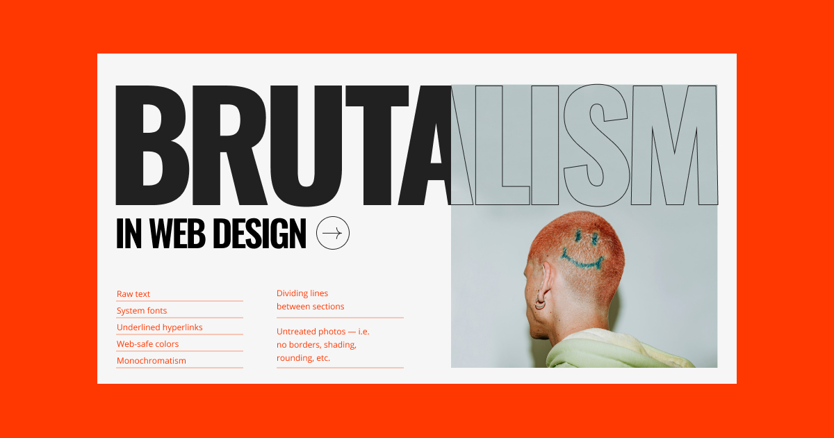
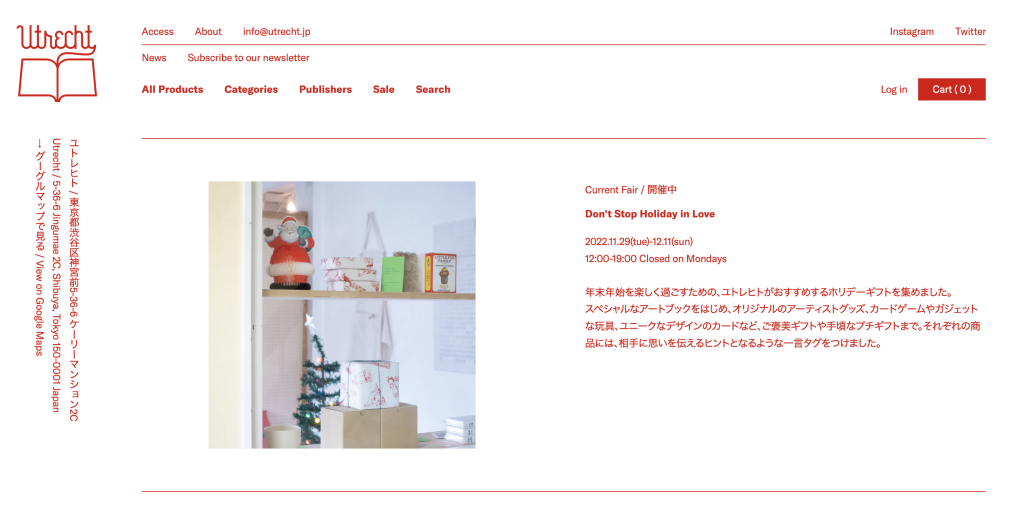
Figure 4 and 5 also display two varying examples of a brutalist web design using different approaches. Utrecht in figure 4 follows a fairly simple template style, however has simplified the webpage to be limited to white and red.
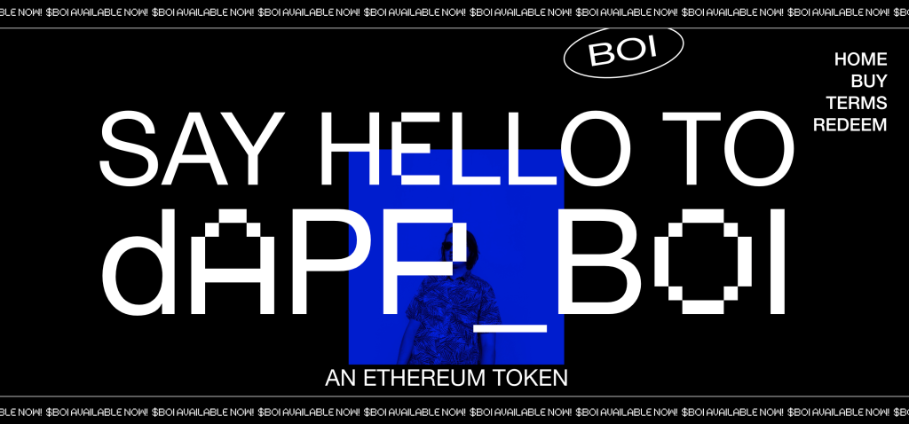
‘DAPP’ follows a similar approach colour wise by only using black and white, with a splash of blue for colour. However the cryptocurrency website has gone for a more unique style when it comes to their template by including an animated banner at the top and bottom as well as an unusual placement for the menu , which goes against the typical website conventions.
References
Deville, P. (2018) Brutalist Websites. Brutalistwebsites.com. Available online: https://brutalistwebsites.com/ [Accessed 8 Dec. 2022].
Studio Push (2022) Studio Push. Studio-push.com. Available online: https://studio-push.com/ [Accessed 4 Dec. 2022].
Werkleitz Festival (2018) Holen und Bringen – Werkleitz Festival 2018. Werkleitz.de. Available online: https://hub.werkleitz.de/ [Accessed 4 Dec. 2022].
Shviro, N. (2022) What Is Brutalism in Web Design? Elementor. Available online: https://elementor.com/blog/brutalism-in-web-design/ [Accessed 11 Dec. 2022].
Utrecht (2022) ユトレヒト / Utrecht. Utrecht. Available online: https://utrecht.jp/ [Accessed 11 Dec. 2022].
DAPP (2022) DAPP BOI – The human backed Ethereum token. Dappboi.com. Available online: https://dappboi.com/ [Accessed 11 Dec. 2022].