With my characters environment and background, I have chosen to use a darker colour palette. This mainly includes browns and reds for the main aspect of the clothing as well as some other colours that would be used for details. Below is a diagram of the colours I will mainly be using, as well as a small note of what they will be used for.
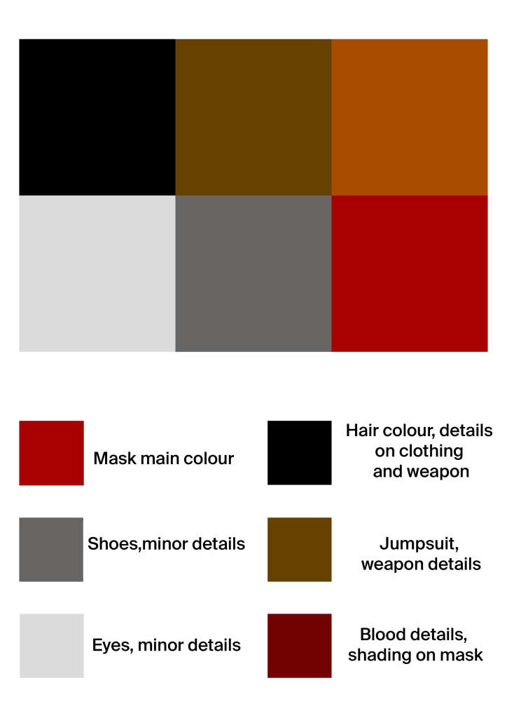
I wanted my character to take the idea of a clown outfit, and remove the bold, colourful aspect to match his personality and desire for revenge and murder. Unlike a stereotypical clown to some people, I wanted my character to be menacing and ruthless, instead of creepy and scary. This is why I have chosen brown as the jumpsuit colour as its dark but also brings in the connotations of the deer which is why he is planning his acts. In addition I have chosen his mask to be red with blood detailing to add depth to this outfit and show he is out for murder. Furthermore I have chosen other dark and less adventurous colours for additional details and clothing such as shoes and hair as these are less relevant to his outfit and are more for practicality rather than design.
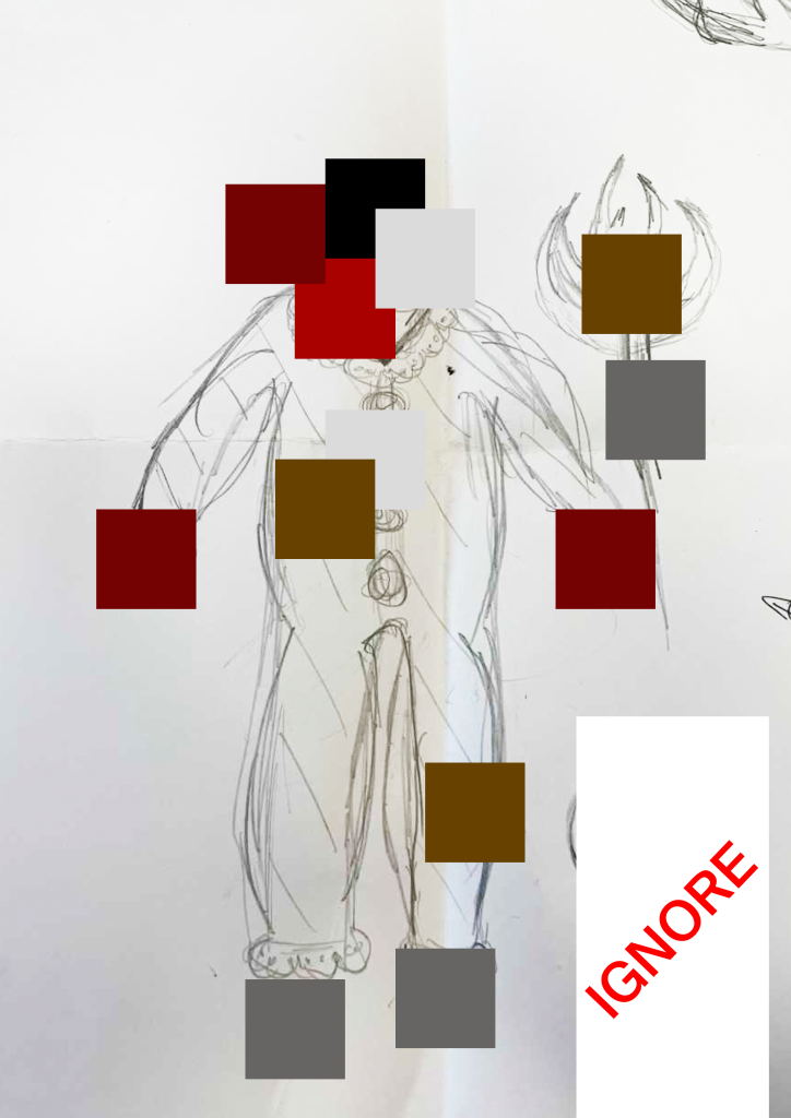
Above is a diagram of how the colours from my palette will be used within the character production. Some colours will be used more than once, as seen with the whites which will be used for the eyes as well as detailing on the jumpsuit. This will be used as a guide, however during production the colours may change or additional colours may be added if they fit the design better.
It’s good to keep a consistent colour palette throughout which is why I believe me creating this plan will ensure my character is unified and looks realistic colour wise. If I were to add any extra colours, they would have to match the theme which eliminates any bright and bold colours.