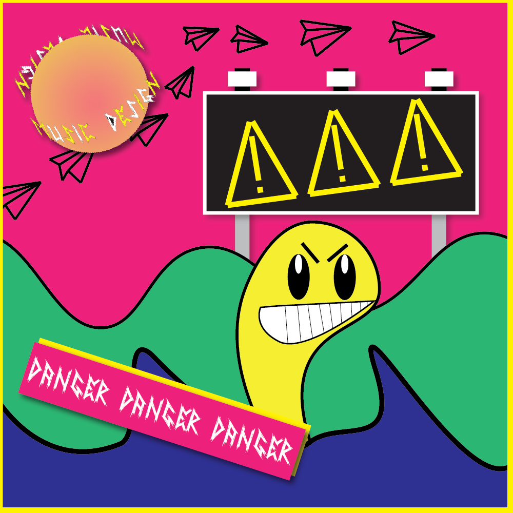
I decided to take my topic of music design and make an album cover style piece using only shapes and text. Each part of the artwork is made up of basic shapes that have either kept their shape or have been transformed by moving their vertices around to create a unique shape.
What I’ve attempted to do is create a scene within the cover , which I have taken inspiration from some of my favourite albums such as ‘Dookie’ by Green Day where the cover is made up of different assets to create a story out of it. Furthermore I wanted the cover to be bold as if it was the cover of a vinyl record that would catch someones eye instantly in a record store, which is why I used bright colours and thick outlines for each item. Also by making everything bold, it means that the cover is suitable for all forms of media, whether its a CD or Vinyl or even the cover on your phone when you’re listening to the album. Yellow and pink are the two main colours I wanted to choose as they’re bright so they stand out above the rest and they also resonate with me as colours a lot of bands used in the 80’s and 90’s for their singles and album covers.
I incorporated my previous logo into this by making it the sun and having the original text revolve around it like its a planet in the sky. This is the only asset this is not a solid colour, as I used a gradient of orange and yellow over a simple circle shape to create the effect of a sphere. By doing this, it allows people to understand that it is the logo or in this case, the symbol of the band – not the name of the album.