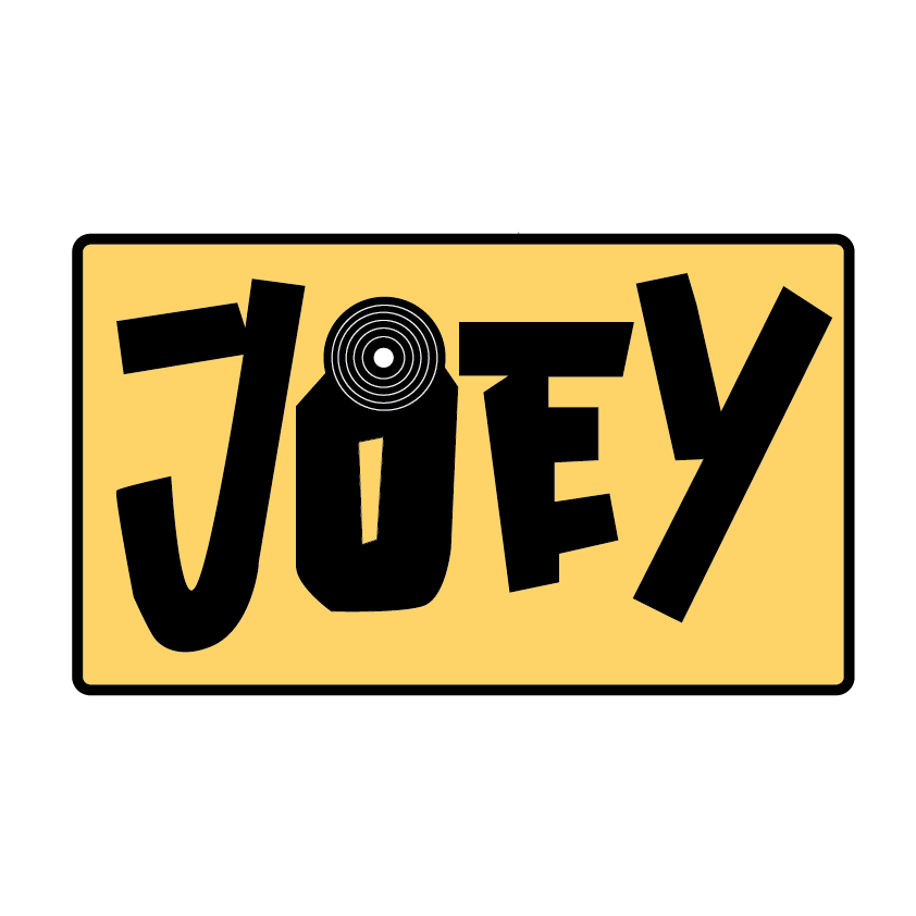
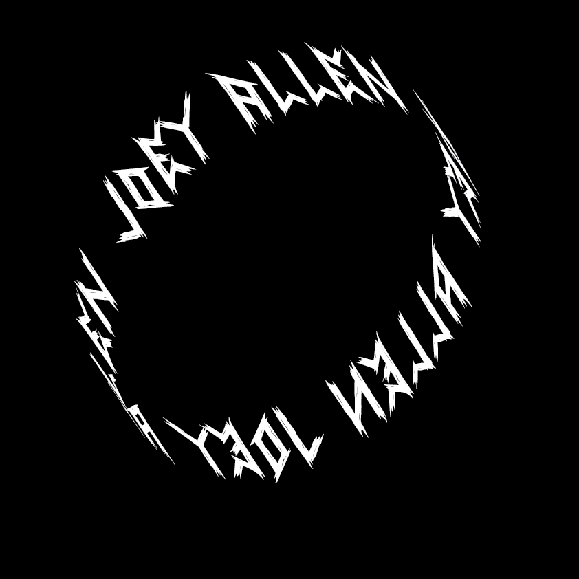
Above is two logos I designed using Adobe Illustrator, bringing aspects of my design influences and transforming them into a professional logo.
The initial task was create one, but I designed a few and these two are my favourites as I feel they subtly but correctly capture my design influences.

Above is my first attempt, which is a simple ‘rotating’ ellipse which consists of my full name all the way around. This is also done in a gothic/grunge font as many of my influences are that style. In addition I have subtly tried to incorporate vinyl records into this piece as the artworks on most albums, inspire me to create pieces similar. The way I did this was by making the logo a circle style but at the same time make it look like it would rotate if it was not inanimate. This was made using a basic circle that had been shaped to be angled and then text added to it using the ‘Type on Path’ tool.

The logo above takes a slightly different direction. with this one I tried to incorporate a Japanese style but keeping it english and once again involving a vinyl record style vector as a small addition. I am a big fan of Japanese adaptations of UK/American movie and music poster design so that’s the rough style I went for on this. Once again I used my name but used the pen tool on Illustrator to outline the letters and fill them in black. Then to finish it off I used the basic rounded rectangle shape with a slightly thicker stroke to create a simple background for the text. I intend to carry on this style into the projects that follow this as I really enjoy the styles I used for these two logos.


